This year in April myself and two of my peers travelled to Sheffield Hallam University were a lecture was given by the amazing Vince Frost, I’ve become a really big fan of his work and I was thrilled to get a chance to go to this lecture to be hear his experience with the design world. He talked about his new book Design Your Life and I think just the book itself will be very inspirationally as it helps you examine yourself and how to improve yourself and the work you produce. At the end of the lecture he was open to different questions, and he talked about is past experience with working with different people and his mentor he admired and followed around to improve himself, then we went down to get a signed copy of his new book bur sadly he had run out and we started talking about travelling from Liverpool and surprisingly he was coming up here the next day and offered to bring use the signed copies of the book which was lovely, so then Kim talked about how she worked at Anfield as his son was doing trails here and then offered him a free tour of the Anfield, well all I can say is that it was a wonderful day and I am grateful he cared enough to bring us copies of his books. So I think its key to have different connections to get yourself out there, which I will try doing by contact and getting involved with the different online and in-store companies that allow different artists and designers to display and sell there work, such as Etsy which I’ve had for a few years now but haven’t created anything Ive found would work, so I need to go back and think of what will be sellable at this time. Art Hob 47 in a shop that allows you to show and sell your work with a small fee, and I’m also looking into the Summer Art Market in St Georges Hall were you can get a stall to sell work.

Looking at the Handsome Frank Illustration Agency I’ve emailed a few of the arts to ask about how different things have benefited them to their work out and about, and how they product their work. Which will lead me into looking at different printers that will benefit me, finding a reliable source to print my work to high standards, as well as looking at publishing which will obviously not be an over night thing but I will message other publishers and the likes of Vince Frost because Ive already received feedback from him on previous work I’ve done on him, were he commented on my letter press video saying he loved it and then also liked my other final letter press peices. I’ve also had feed back from Hugo Moss who’s company is Hugedesigns after I emailed him about what he would look in someone he was going to give a internship too.

Essay

After doing the essay for Paxman I realised a few different things about the design world and myself. I chose two different artists to write about, Shaun Tan and Banksy both totally different artist which I liked the juxtaposition between them. I picked Tan because I absolutely loved his drawings which wish I still did a lot more of as I’ve moved away from a drawing and moved to digital which I’ve also become to love but I think I’m going to step back and give my self time to get back into drawing more regularly, so I can do things like draw tattoo design for a tattooist my brother knows and has asked for any drawings for him to use in his shop, tattoo is something I’ve always loved and have wanted to be involved in anyway possible. As well I’d like some hand generated design to sell online or in-store with some digital design to go with it, so I’ll be doing both the things I enjoy doing. This will hopefully help with any of the individual Freelance I will optimistically be doing in the future aswell I’d like to work with a collective, with my uni friends and form our own design company. Which will need so much research and effort which I’ll get from different sources and individuals

Exploring Hyperreality

In Adam’s last lecture we watch part of the film Westworld which is about an advanced theme park that allows you to interact with life like robots. It had 3 different resorts to appeal to people, life size vacation spots, all fake worlds. The resorts were Westworld, Romanworld and Medievalworld. All these involve hyperreality and here are some examples that I saw while watching;

Rather than saying I married a robot, a man in Medievalworld says ‘Married a beautiful woman’ as if he truly believed he married a human.

‘The men stick out’ said the woman in Romanworld, another person referring to the robots as a living beings with a gender.

The man in Westworld finds it difficult to pull the trigger on a realistic looking man, there is hesitation but in the end he shoots the robot and it bleed just like a human would. ‘Pretty realistic, huh?’ ‘Are you sure he wasn’t?’ In the end he is still questioning whether he truly killed a man.

Uncanny Valley is the creation of something heading to hyperreality but instead of becoming something believable it becomes something that makes the viewer uncomfortable or disgusted.

Examples

Twilight Baby

breaking-dawn-renesmee-original-doll Renesmee

Saya, the Reception Robot

image.jpg reception-robot

Telenoid R1 Bot

1664206 Telenoid-R4-front2

http://tvtropes.org/pmwiki/pmwiki.php/Main/UncannyValley

http://www.psy.gla.ac.uk/~frank/Documents/InSearchUncannyValley.pdf

http://www.nature.com/srep/2012/121115/srep00864/full/srep00864.html

Umberto Eco

Travels in Hyperreality

Two weeks ago we were given a task read an essay from Uberto Eco, Faith in Fakes. We had to read first essay Travels in Hyperreality. Which then the next we would discourse about what we had got from the essay. I think defining the word hyperreality before I starting to read the essay helped a lot. These are the two definitions that I found;

1. Exaggerated in comparison to reality: his characters are hyperreal rather than naturalistic.

2. (of artistic representation) extremely realistic in detail.

I at first reading the essay and understanding was difficult until the part about Superman and his robots, which showed the definition ‘(of artistic representation) extremely realistic in detail.’ and I started to understand more about hyperreality.

Whilst we discoursed it last week I understood more when we all gave our opinions and when Orlando Florida was mentioned I realised one of my favourite things had been turned into hyperreality! Harry Potter world is a perfect example, when something has come to life from a book series and there is life size repuclares models of Hogsmade have been made, which you can go in and get yourself a drink of Butterbeer something which was also just something in a fictional story brought to life. A personal experience of hyperreality would be when I went to the Harry Potter Studios down in London where I got to step in to the great hall, when you are in there you are not thinking “oh I’m on the movie set” its more like “oh my god.. I’m in the great hall where Harry, Ron and Hermione were… Oh look there is Dumbledore” Even if it was only his costume. Haha

Thinking Types

Vince Frost etc

Our first brief was Editorial ‘Thinking Type’ were we chose a graphic designer/typographer from the list and then we would design a magazine article on that artists and around his/her design practice. Which needed a cover and two double page spreads, we also had to do 20 pages of research.

So first off I went through the list of designers and typographers to see which I thought I’d most like to do, so I narrowed it down to about 6 people and looked at them and their work more in depth. The two designers that stuck out to me were Vince Frost and Why Not Associates because I really like the layout of their work. Specially the us of typography by Vince Frost.

So then I had to chose between the two, so I chose Frost as I liked him most from the beginning. I started to research as much as I could to find as many pieces of his work I could, first I found his Frost* Collective website, which led me to the Big magazine I was fond of. I also went on social media to find his work where I found that he was about to release a book called Design Your Life, he had posted example of what would be in the book on Twitter and Instagram.. I was really excited about the book because of what I saw. This all helped me get in to the same frame of mind as Frost so I could create the cover and two double page spreads based on his design and layout.

I also looked at individual typographers, the two main ones I liker was Baskerville and Avenir. But as I was doing Frost and not Why Not Associates I chose Avenir to be the type that would be used through out the article about Vince.

Do see the outcome of my 20 page research I’ve uploaded it to ISSUU click the image below.

Screen Shot 2014-12-15 at 23.50.46


To see the Vince Frost inspired layout and design click below… I’ve also added another two double page spreads that were inspired by Vince

Screen Shot 2014-12-15 at 23.54.47

Cornell Notes

In this weeks lecture with Paxman we looked at Cornell note taking, which is a of organising your notes. So Adam gave us all a sheet that had; Thoughts, Ideas, Reflection, Questions, Opinion, Facts, Peers thoughts and Lecturer thoughts. Then we were paired up to go and find 2 good and 1 bad pieces if work from 1960s on words. So me and Faye went down to the library because we weren’t aloud to us the computers.

We found the book ‘100 ideas that changed graphic design’ which had some excellent designers in. First we found Saul Bass’ 1961s West Side Story which we both thought was great, we loved how he used the typography as a building with brick like font and then added stairs to the side to make the building have a fire escape which is an american style building. So that was our first good piece of work, then we found work by Vince Frost. It was one of the covers of Zembla magazine with Tilda Swinton on. We liked the use of hand written type on the orange jumper of Swinton’s with the dark background, then we liked the use of the white ‘Z’ stripe contrasting the background and how it does not cover Swinton’s face which I think gives it depth. The final piece we found that we had to make as a “bad” piece of work was by Stefan Sagmeister, which is the designer we looked at in the first lecture so we know he has some good work that we liked but sadly we found one that we weren’t to fond of because how over crowded with type and other thing it was, which me and Faye both found difficult to read not because it was in a different language but the fact the text on the people was hard to read. With all the pieces of work we found there will be lovers and haters of the work and artist because there is so many different opinions.

Aside

Contemporary Contextual Studies

Back to Paxman’s Contextual Studies, were we will now start on Contemporary art movements. We started off with a defining activity were we were in pairs and had to come up with the definition of 4 words; Contemporary – Which we all agreed meant ‘In the now’, which would relate to the art happen in the 21st century. Postmodern – Which means after Modernism, Modernism being the era of art we looked at in the previous year ‘Historical Contextual Studies’. So this will then be related to Contemporary art as it is after Modernism. Evaluation – Which is looking over work, pointing out the strength and weaknesses of work and making a conclusion. Continuum – Which a more difficult word to define, I knew the word from ‘Space-Time Continuum’ on Doctor Who and other Sci-fi Movies and TV shows. But the definition related to art was ‘were movements fit in a timeline’ Objective – the task and having an goal is one of the definitions, be the definition we needed was objective and subjective truth, which would make something that can be proven rather than subjective which is something you believe is true but it hasn’t been proven.

Stefan Sagmeister

Then we looked at the typography by Sagmeister.

Having guts always works for me

Stefan

Using different objects to spell out a sentence, using different techniques and perceptive to create type.

Self – Confidence produces fine results

bananawall_1

Sagmeister used 10,000 bananas to create this piece, which will in time the bananas will all over ripen and this piece will turn all brown.

AIGA Detroit Poster

AIGAdetroit_LORES

This is a poster Sagmeister did were he got one of his co workers to carve in to his skin, this left scars and he will be forever burdened with this text thats from a past invite.

Stefan Segmeister also relates to our ‘Thinking Type’ project, were we create a cover and 2 double page spread inspired by one of the artists on the list, one being Segmeister who is a divergent, type based artist. Whether its 3d/photography or hand drawn typography. We also reflected on a last timeline 1850 – 1959 modernism and we drew out a timeline and wrote the art movements and the artist or other things related to that year, also recapped on the typography side of the modernist era.

  http://www.sagmeisterwalsh.com/

Yeah baby!

YES! So happy its just the final touches that are need, we can relax a little! (Thanks for telling me that I was going on your blog, I may have smiled a lil’…)

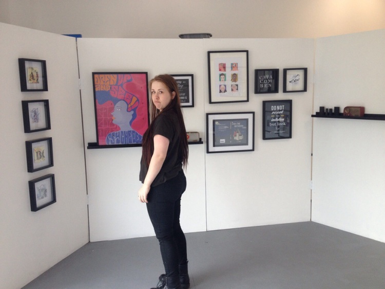
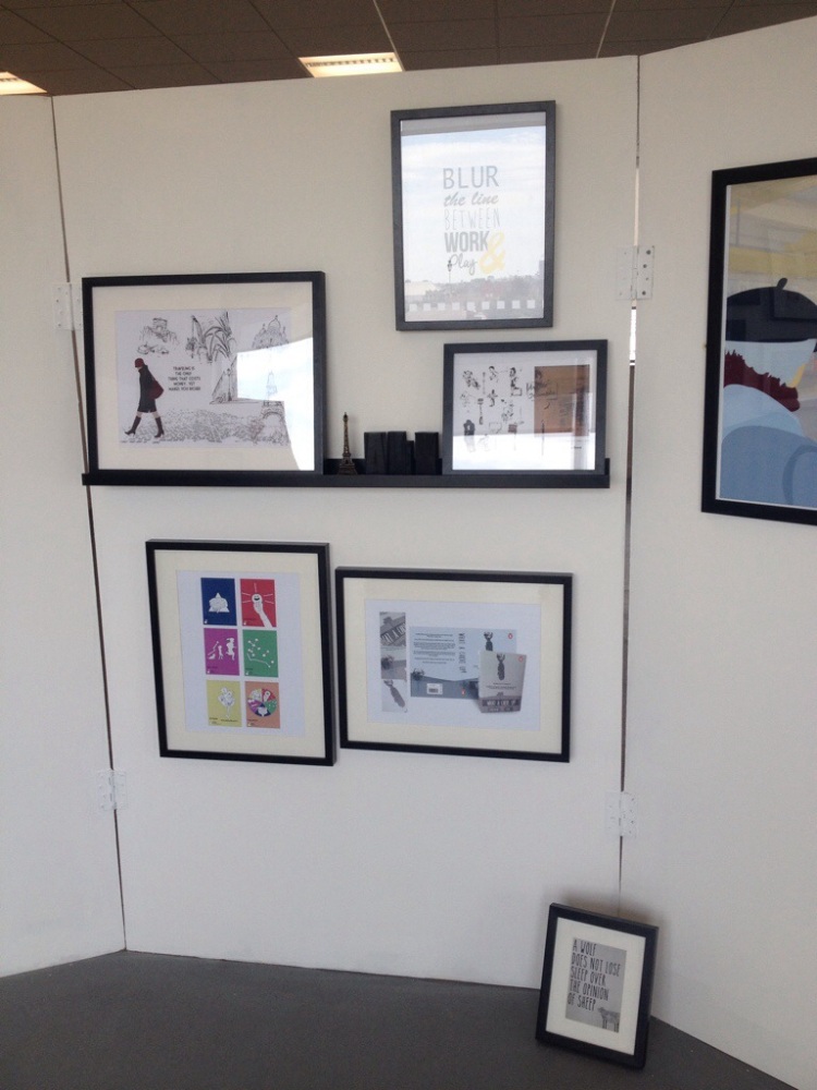
This is what amma talking about! Now all I have to do is relax till Tuesday! All my frames and boards are done! And I mean completely finished! I’m a happy bunny. Oh and Jennie’s are too, we are proud parents of our boards!

20140606-223914-81554701.jpg

20140606-223913-81553179.jpg

View original post

The Recap Game

In last weeks lesson we had a very fun session were we got to play a game simpler style/layout to Monopoly, made up by Adam Paxman were we would recap on all the art movements and history we looked at through 1850 to 1959, the Modernist era. We would get a question when we landed on a piece of art or person and if correctly answered we would then own that location and get a yellow token. At the end of the game the person with the most tokens would win. I have to say the best ‘man’ did win, which was me! Yay!

Overall I loved the game and it helped with reflecting back on what we had done previously and reminded me of things that I had forgot or weren’t sure about. Also there was a few Red Herring thrown in there that got me too.